The brief
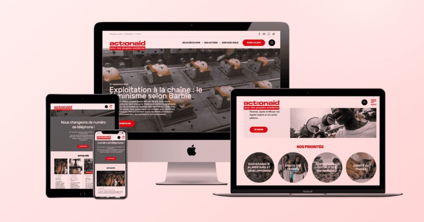
ActionAid runs campaigns against poverty and injustice, and each one needs its own page: somewhere that explains the issue fast, looks like the campaign and asks the visitor to do one thing. Donate, sign up or share, not all three at once.
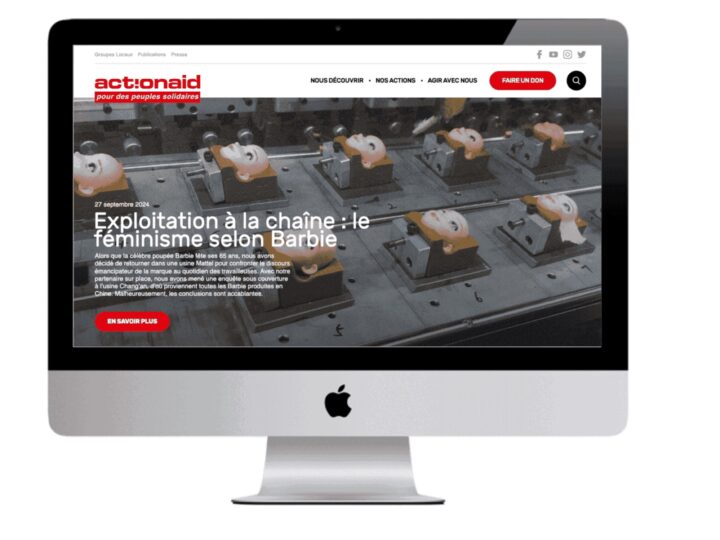
Traffic to these pages behaves differently from traffic to a normal website. People arrive from an email, a social post or an ad, usually on a phone, and they give you a few seconds. If the headline and the button are not on the first screen, most of them are gone. ActionAid needed a series of pages that felt like one family, carried the organisation’s identity and held up on a small screen.
What we built
- A shared structure, not a set of one-offs. Designing each campaign page from scratch would have made the fifth page as slow to produce as the first. Instead we built a common set of sections that each campaign dresses with its own message and imagery. New pages became an assembly job, and they stayed on-brand without anyone having to police it.
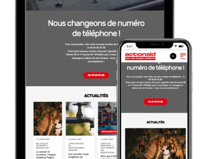
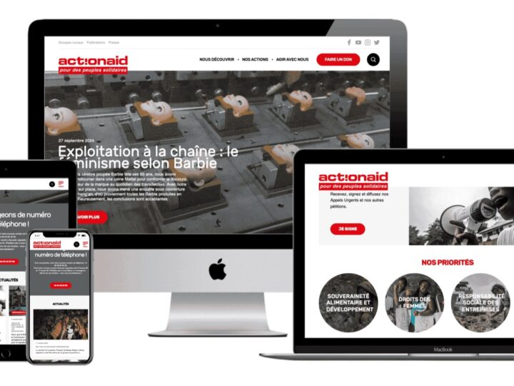
- Phone first. We laid out every page for a small screen, then widened it for tablet and desktop. The rule was simple: the key message and the call to action had to be visible without scrolling on most phones.
- Short forms. Donation and action forms were matched to each campaign’s goal, cut down to the fields that were actually needed and clearly labelled. Every extra field on a campaign form is another reason to leave.
- Built to be promoted. These pages live on email, social and paid promotion, so each one had a focused headline and its own share preview.
Technology
The pages ran on a shared, responsive front-end template with reusable sections. Donation forms and calls to action sat inside each page, so supporters could act without being bounced somewhere else.
A shared template has one obvious downside: sooner or later a campaign wants something the system doesn’t do. Our view is that when that happens you add a new section to the system, rather than forking one page and maintaining it on its own forever.
Deliverables
- Multiple campaign landing pages with a shared design system
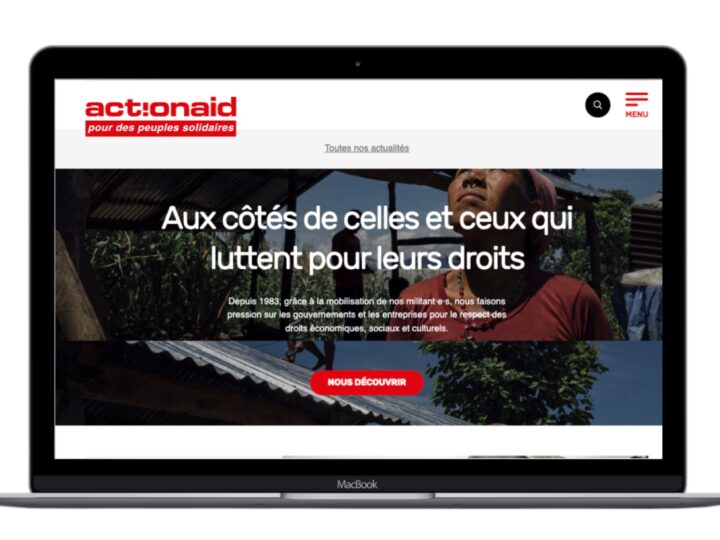
- Responsive layouts for mobile, tablet and desktop
- Integrated donation forms and campaign calls to action
- Pages prepared for email, social and paid promotion
- Reusable page sections for future campaigns
What this project shows
A landing page has one job. The same thinking works for product launches, events and seasonal offers, and once the reusable sections exist, each new page costs far less than the first. If you need focused pages for a campaign, see our web development service, read about mobile-first web design, or talk to us.