 Web design
Wix vs a web agency: the real 3-year cost for a UK small business
Wix is usually cheaper in cash. We add up three years of costs on both sides, including your own hours, and explain when an…
· 8 min read
Web design
Most of your customers meet you on a phone, and Google ranks your mobile site. What mobile-first design means in practice, a ten-minute test and what fixes cost.
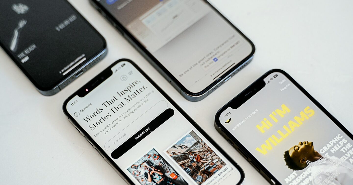
Mobile-first web design means you design and build the phone version of your website first, then expand it for tablets and desktops. Responsive design only promises that the layout adapts to the screen. The difference matters because, for most UK businesses, the phone is where a customer first meets you, and since 2024 Google has crawled and ranked sites almost entirely on their mobile version. If your site was designed on a 27-inch monitor and squeezed down afterwards, the version Google judges and most visitors see is the afterthought.
Below is what mobile-first means in practice, a ten-minute test you can run on your own site today, the mistakes we fix most often and what it costs to put right.
Ofcom’s Online Nation reports have shown for several years that the smartphone is the device most UK adults use to go online, and that a large share of browsing time happens on phones. That is the national picture. Yours will be different, so check it before you spend anything.
In Google Analytics 4, open Reports → Tech → Tech details and switch the dimension to Device category. Look at the last 90 days, not the last week. Then look at conversions (form fills, calls, sales) by device, because traffic share and money share are not always the same thing.
Here is the rough pattern we see across client sites:
| Type of business | Typical mobile share of visits | What that means |
|---|---|---|
| Trades, salons, restaurants, local services | Usually well over half, often 70 %+ | The phone site is the website. Desktop is secondary. |
| Consumer e-commerce (fashion, gifts, beauty) | Usually the majority | Checkout on a phone decides your conversion rate. |
| Professional services (accountants, solicitors) | Roughly half | First visit on a phone, enquiry often on a laptop later. |
| B2B, software, manufacturing | Often under half | Desktop still matters, but buyers check you out on the train. |
Those are ranges from our own projects, not a survey. The point is that even a B2B firm in Leeds selling to procurement teams gets a meaningful slice of first impressions on a 6-inch screen, and a mobile hairdresser in Cardiff may get nearly all of them.
Google moved to mobile-first indexing over several years and completed the switch in 2024. In plain terms, Googlebot visits your site pretending to be a smartphone, and the content it finds there is what gets indexed and ranked. Three consequences follow.
Almost every site built in the last ten years is technically responsive. The columns stack, the menu turns into a hamburger and nothing scrolls sideways. That is the minimum. Mobile-first is a different starting point, and it shows in the decisions:
| Decision | Responsive (desktop first) | Mobile-first |
|---|---|---|
| Starting design | 1,440 px wide mock-up, shrunk later | 360 px wide mock-up, expanded later |
| Content order | Whatever looked balanced on desktop | What a person on a phone needs first: what you do, where, price, how to contact |
| Images | Large hero images scaled down by the browser | Correctly sized files per screen, modern formats, lazy-loaded below the fold |
| Navigation | Mega-menu squashed into a hamburger | Short menu, key actions visible without opening it |
| Calls to action | Buttons in the sidebar, which ends up at the bottom | Tap-to-call and a primary button within thumb reach |
| Forms | Ten fields, small inputs | As few fields as possible, right keyboard for each field, autofill working |
| Testing | Checked in a browser window dragged narrow | Checked on real iPhones and Android phones, on a throttled connection |
The desktop version of a mobile-first site usually ends up better too. When you have been forced to decide what matters on a small screen, the large screen gets less clutter.
Someone searching “emergency plumber Bristol” on their phone wants three things in the first screen: that you cover their area, that you can come today, and a button to ring you. A three-paragraph company history is not in that list. We write a short brief for the first screen of every key page before anyone opens a design tool.
WCAG 2.2, the accessibility standard we build every template to, sets a minimum target size of 24 by 24 CSS pixels at level AA. Apple and Google recommend larger, around 44 to 48 pixels, and that is what we use for anything people tap often. Links in a paragraph need enough spacing that a thumb does not hit the wrong one. Primary buttons sit low enough on the screen to reach one-handed.
Body text at 16 px minimum, line length that does not run edge to edge, decent contrast in sunlight. Form inputs also need 16 px text or iPhones zoom in when someone taps the field, which throws the layout around and annoys everyone.
Small details make a big difference on a phone. A phone number field should open the number pad (type="tel"), an email field should show the @ key, and autocomplete attributes should be set so the browser can fill in name, address and postcode in one tap. For UK addresses, a postcode lookup saves people typing a full address on a glass keyboard.
A 3 MB hero photo looks the same on a phone as a 120 KB one cut to the right size. We serve WebP or AVIF images at several widths and let the browser pick, so a phone on 4G never downloads the desktop version.
Take your own phone, turn off Wi-Fi so you are on mobile data, and open your website from a Google search, not a bookmark. Then work through this:
Then run the page through Google PageSpeed Insights on the mobile tab. Look at the “Discover what your real users are experiencing” section first: that is field data from Chrome users, which is what Google uses. The Lighthouse score below it is a lab test, useful for finding causes.
If you answered no to three or more of the questions above, the site is costing you enquiries.
Our process is the same for a five-page site for a café in Manchester and a large catalogue for a retailer in Birmingham. Wireframes start at 360 px wide. We agree the content order for the first screen of each key template with you before any visual design. Themes are hand-built, with no page builder, so the code that ships is only the code the page uses.
We target a Lighthouse score of 95 or more and WCAG 2.2 AA on every template, then test on real devices: at minimum a current iPhone, an older iPhone with a small screen and a mid-range Android phone, with the connection throttled. Forms are tested end to end, including the email that arrives in your inbox. Before launch we check the mobile and desktop versions carry the same content, so nothing is lost to Google.
We are based in St Albans and work with businesses right across the UK, mostly remotely, with in-person meetings in London and the Home Counties when that helps.
All our website packages are designed mobile-first. These are our current offer prices, excluding VAT:
| Option | Price (excl. VAT) | Best for |
|---|---|---|
| Startup Website | £350 + £99 mobile responsive add-on (+ £149 if you want a CMS) | A new business that needs a clean five-page site quickly |
| Pro Website | £750 | Up to 10 pages with a CMS and a project manager |
| Elite Website | £999 | Up to 15 pages with bookings, payments and lead forms |
| Business / E-commerce | £2,650 | A custom WordPress or PHP site or shop with the works |
| Fixing an existing site by the hour | From £45/h (design) or £50/h (WordPress) | A sound site with mobile problems you want fixed rather than rebuilt |
On the Startup Website the mobile responsive add-on is optional on paper. In practice we would always take it: a site that does not work on phones is not worth £350.
Worked example: fixing an existing WordPress site. Say your site is two years old, the content is good, but the mobile version is slow and the forms are awkward. A typical mobile clean-up (image optimisation, a slimmer header, form fixes, removing a slider, tidying the menu) takes around 10 to 15 hours. At 10 hours of WordPress development: 10 × £50 = £500, less the 5 % volume discount = £475, plus VAT of £95 = £570. Hours are paid online through hire us and never expire, so anything left over can go towards later changes.
If the site is built on a heavy page builder or an old theme, patching it can cost more than it is worth. Past about 25 to 30 hours of fixes, a rebuild on one of our fixed-price packages is usually better value, and we will tell you which side of that line you are on.
Usually not. If customers use your service once or twice a year, a fast mobile website is the right answer. An app earns its keep when people come back often, for example to rebook, reorder or track something, or when you need features like push notifications, offline use or the camera.
There is a middle option. A progressive web app is a website that can be added to the home screen, work offline and, on most devices, send notifications, without going through the app stores. When a full app does make sense, we build for iOS and Android together with Flutter; see our mobile app development service.
Run the ten-minute test above and the PageSpeed check on your three most important pages: the home page, your main service or category page and your contact or checkout page. If the problems are small, a few hours of fixes will do. If the site fails on most counts, start again on a mobile-first build. Either way, send us the link through our contact page and we will tell you honestly which route makes sense, and roughly what it costs, before you commit to anything.
Responsive design means the layout adapts to any screen size. Mobile-first is a way of designing: you start with the phone version, decide what matters most on a small screen, then expand for larger screens. A mobile-first site is always responsive, but a responsive site is not necessarily designed with phones in mind.
On its mobile version. Google completed the move to mobile-first indexing in 2024, so Googlebot crawls as a smartphone and indexes the content it finds there. Content that is hidden or missing on mobile may not count towards your rankings.
Open it on your own phone over mobile data and try to find your services, call you and fill in your form. Then run the page through Google PageSpeed Insights on the mobile tab and check the Core Web Vitals field data. Google retired its old standalone Mobile-Friendly Test in 2023.
For a WordPress site that is basically sound, fixes typically take 10 to 15 hours. At our £50/h WordPress rate, 10 hours costs £475 after the 5 % volume discount, or £570 including VAT. If the site needs much more than that, a rebuild from our fixed-price packages (from £350 + VAT) is often better value.
We design from 360 px wide upwards and test on real devices: a current iPhone, an older small-screen iPhone and a mid-range Android phone, plus tablet and desktop. Testing on a throttled connection matters as much as screen size, because many visitors are on 4G.
Most businesses do not. An app makes sense when customers return frequently or you need push notifications, offline use or device features. A progressive web app can cover some of that without the app stores. We build both, and we will tell you if an app is not worth the money.
Photo: Azwedo L.LC via Unsplash
Web design
Wix is usually cheaper in cash. We add up three years of costs on both sides, including your own hours, and explain when an…
· 8 min read
 Web design
What really exports from Wix and Squarespace, how to map and redirect every URL, and the switchover order that keeps your Google rankings intact,…
· 10 min read
 Web design
No UK law names WCAG for private businesses, but the Equality Act 2010 still applies to your website. What the law expects, when EU…
· 9 min read
A developer replies within one working day. Fixed price or hourly, your choice — and the code is yours.