 Web design
Website accessibility and UK law: what a business site must do (WCAG 2.2)
No UK law names WCAG for private businesses, but the Equality Act 2010 still applies to your website. What the law expects, when EU…
· 9 min read
Web design
Colour does affect how people feel about your business, but contrast and consistency drive clicks far more than the hue. A practical method for picking a palette that works and passes accessibility checks.
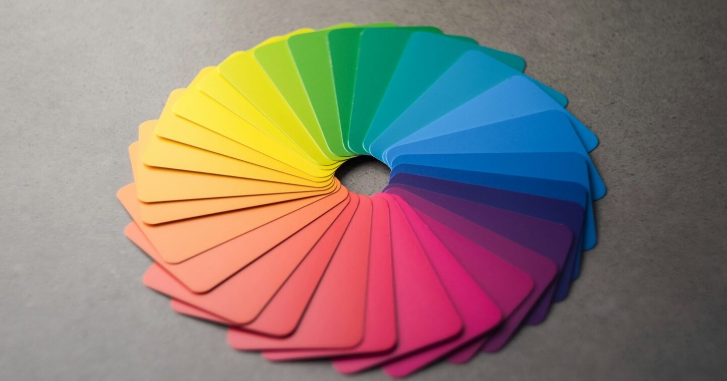
Colour psychology matters less than most articles claim, and contrast matters more. Colours carry loose associations (blue reads as dependable, green as natural or financial, red as urgent), but those associations change with culture, context and your sector, and no colour lifts conversions on its own. What reliably helps is a restrained palette, one accent colour kept for the actions you want people to take, and text and buttons with enough contrast to read on a phone in daylight. Below is the step-by-step method we use, the WCAG 2.2 contrast numbers you need to hit, and the mistakes we see most on UK small business sites.
There is real research on colour and emotion. People do form an impression of a website in a fraction of a second, and colour is part of that. Colour also helps with recognition: customers remember a brand’s main colour long before they remember its logo.
Where it goes wrong is the leap from “blue suggests trust” to “make your site blue and you will sell more”. Popular infographics claim precise effects for each colour. We have not seen good evidence for most of them, and they ignore the obvious: a blue accountancy site in Leeds and a blue surf school in Cornwall send completely different signals because everything else on the page differs.
A more useful way to think about colour has three parts:
Use this as a starting point for conversation, not a rulebook.
| Colour | Typical associations in the UK | Sectors where it is common | Watch out for |
|---|---|---|---|
| Blue | Calm, dependable, professional | Finance, tech, healthcare, legal | Very common, so it can look generic |
| Green | Nature, health, money, “go” | Eco, gardening, finance, wellbeing | Light greens fail contrast easily |
| Red | Urgency, energy, warning, appetite | Food, sales, emergency services | Reads as an error if overused in forms |
| Orange | Friendly, affordable, active | Trades, retail, children’s services | White text on orange rarely passes contrast |
| Yellow | Optimism, attention | Cleaning, construction, signage | Unreadable as text on white |
| Purple | Creative, premium, sometimes spiritual | Beauty, education, charities | Can look dated in some shades |
| Black and near-black | Premium, minimal, serious | Fashion, architecture, luxury | Tiny grey-on-black text is common and hard to read |
The most consistent finding in conversion work is not about which colour, but about difference. An item that looks unlike everything around it gets noticed (psychologists call this the isolation or Von Restorff effect). That is why the old “red button beat green button” tests produce contradictory results: the winning colour was usually the one that stood out from that particular page.
In practice:
If you have a logo, the palette starts there. If the logo colour is too light or too bright for buttons, keep it for the logo and pick a darker shade of the same hue for interface elements. Customers will still read it as your colour.
A website palette is smaller than most people expect:
You need a red for errors, a green for success and usually an amber for warnings. Keep them separate from your brand colours where you can, so a customer never confuses your branding with a failed payment message.
Each colour needs a light and a dark version: a pale tint for backgrounds and hover states, a dark shade for text on light backgrounds. We define these as design tokens in the theme, so they can be changed in one place later.
Check every text and background pair, every button and every form border with a contrast checker before design sign-off. It is far cheaper to adjust a shade on day three than to repaint a finished site.
A palette that looks lovely on a mood board can fall apart with real photos, long headings and a cookie banner. Look at it outdoors on a mid-range Android phone with brightness turned down. That is how many of your customers will see it.
Under the Equality Act 2010, service providers in the UK must make reasonable adjustments for disabled people, and a website is part of the service. The standard everyone measures against is WCAG 2.2 at level AA, which we build to on every template. Three of its rules are about colour.
Normal body text needs a contrast ratio of at least 4.5:1 against its background. Large text (roughly 24px regular or 19px bold and above) needs 3:1.
Buttons, form field borders, focus outlines and meaningful icons need at least 3:1 against what is next to them. Very light grey input borders on white are the classic failure.
Colour cannot be the only way information is shown. Links in body text need an underline or another visual cue, not just a different colour. Form errors need a message and an icon, not just a red border.
Here are some real ratios, calculated with the WCAG formula, for common choices against white:
| Colour on white | Contrast ratio | Passes for body text (4.5:1)? |
|---|---|---|
| Light grey #999999 | 2.85:1 | No |
| Mid grey #767676 | 4.54:1 | Yes, just |
| Bright orange #FF8C00 | 2.33:1 | No |
| Burnt orange #C2410C | 5.18:1 | Yes |
| Bright green #22C55E | 2.28:1 | No |
| Forest green #15803D | 5.02:1 | Yes |
| Sky blue #0EA5E9 | 2.77:1 | No |
| Deep blue #0369A1 | 5.93:1 | Yes |
| Yellow #FACC15 | 1.53:1 | No (dark text on yellow gives about 9.6:1) |
The pattern is clear: bright, saturated mid-tones usually fail as text or as button backgrounds with white labels. The fix is rarely a different colour, just a darker shade of the same one.
According to the charity Colour Blind Awareness, about 1 in 12 men and 1 in 200 women in the UK have some form of colour vision deficiency, most often difficulty telling red from green. If your site uses red and green to mean “out of stock” and “in stock”, add text. Browser developer tools in Chrome and Firefox can simulate the common types, and we check key pages this way before launch. Our guide to website accessibility in the UK covers the wider legal picture.
It matters relative to the page, not in isolation. A button that stands out from its surroundings, reads clearly and says what will happen (“Get your free quote”, not “Submit”) will beat a beautifully coloured button that blends in. If you have enough traffic, A/B test it. Most small UK sites do not have enough visitors for a colour test to reach a reliable result within a reasonable time; for them, sound design principles and clear copy are a better bet than testing.
For most small businesses, palette and interface colour work is a modest part of a website project.
We start with your existing brand and your customers, not a trend report. We define a small palette as design tokens, check every combination against WCAG 2.2 AA before you see a full design, and test pages on real phones with real content. When a client’s brand colour fails contrast as a button, we keep it in the logo and header and choose a darker accessible shade for actions. Customers rarely notice the change; they just find the button.
If you want a second opinion on your current site’s colours, or a palette for a new build, get in touch. We work with businesses across the UK, from our base in St Albans. For the other things a modern site needs, read what a business website needs in 2026.
There is no single best colour. The best button is the one that contrasts clearly with the rest of the page and with its own text. Pick one accent colour, use it only for primary actions, and make sure it meets WCAG contrast.
WCAG 2.2 AA requires at least 4.5:1 for normal text and 3:1 for large text (around 24px regular or 19px bold and above). Buttons, form borders and focus indicators need at least 3:1.
Colour shapes first impressions and brand recognition, but there is little reliable evidence that a particular hue lifts sales on its own. Contrast, clear calls to action and fast pages make a much bigger difference.
Usually one primary brand colour, one accent for actions, four to six neutrals for text and backgrounds, and functional colours for errors, success and warnings. More than that tends to look busy and dilutes your calls to action.
No. Keep the brand colour for the logo and large decorative areas, and use a darker shade of the same hue for text and buttons. Most visitors will still see it as your colour.
Never rely on colour alone. Add text, icons or patterns alongside colour, underline links in body text, and check pages with a colour-blindness simulator. About 1 in 12 men in the UK have some colour vision deficiency.
Photo: Andy Brown via Unsplash
Web design
No UK law names WCAG for private businesses, but the Equality Act 2010 still applies to your website. What the law expects, when EU…
· 9 min read
 Web design
How to tell whether your site needs a design refresh or a full rebuild, what each costs in the UK, and how to change…
· 10 min read
 Web design
Forget trend lists. The ten things a UK business website needs in 2026 to win customers from Google, AI assistants and real people, with…
· 10 min read
A developer replies within one working day. Fixed price or hourly, your choice — and the code is yours.